01
The farm shop, the butchers counter, Countrystyle Kitchen and the nationwide online shop all share one homepage, and it opens with a WooCommerce product grid instead of the building, so a first-time visitor cannot tell that the Four Meat Carvery and the home-cured bacon come from the same room.
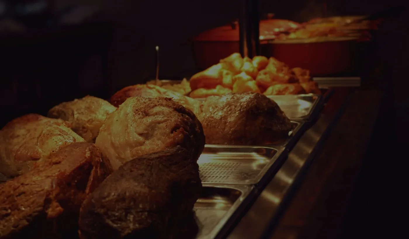
- What I saw
- Loaded countrystylemeats.co.uk on a fresh mobile session. The first scroll is a WooCommerce bestsellers tile-grid (Beef Volcanoes £3, Mince Steak from £6.50, Whole Chicken from £6.60, Pork Chops from £6, Countrystyle Sausages from £3.30). No restaurant photo. No carvery photo. No photo of the Lancaster Leisure Park building. The fact that there is a restaurant on-site has to be deduced from the navigation menu. A customer arriving from a Sunday-lunch Google search who lands on the homepage sees a shop with frozen mince and has no signal that there is a sit-down four-meat carvery in the next room running 12:00 to 17:00 every Sunday.
- Why it matters
- Three separate footfall streams (the carvery diner, the farm-shop walk-in, the nationwide online buyer) are being funnelled through one homepage and that homepage is the e-commerce stream. The TripAdvisor diner planning a roast for Sunday closes the tab. The hamper buyer looking for a £80 gift box scrolls past £3 volcano packs to find it. The farm-shop walk-in checking the address gets a product carousel before the postcode. None of the three are landing on a page that speaks to them in the first scroll.
- After rebuild
- Homepage rebuilt around the building, not the stock list. Three clearly distinct entry-cards in the first viewport: the butchers counter (the bench, the cut), Countrystyle Kitchen (the carvery, the booking line), the online shop (click & collect, nationwide delivery). Each card has its own photo, its own opening pattern, and its own primary call-to-action. The WooCommerce best-sellers grid moves below the fold, where the buyer who came specifically to shop will still find it.